"I love creating rooms with a fresh, all-American glamour that serve up tradition with a twist, says designer Stacie Flinner. For me, it’s about incorporating American, European, and Asian antiques, textiles, and furnishings inspired by my many travels.”
Flinner put her formidable aesthetic to the test when she and her husband relocated from San Francisco to New York City. The couple found their current home in a beautiful Italianate brownstone in the historic, leafy enclave of Gramercy Park. “One major drawback to this building style is the tiny bedrooms,” says Flinner. “But since David and I loved everything else about the location and apartment we just decided to go for it.”
That blithe spirit is showcased in this small (just 7 by 10 feet) but artfully detailed bedroom. Instead of shying away from a challenge, Flinner embraced the scale and transformed the space into a cozy nook inspired by one of her favorite rooms of all time—a sleeper cabin above the famed Orient Express.
So all aboard for a personal tour of this seriously chic interior. Below, Flinner shares her tips for building a space filled with peaceful color, pretty pattern, soothing scale, and more.
If this bedroom had a name, what would it be?
"A polished, preppy hideaway.”
You worked with a small space. This is challenging for a lot of people. What were your guiding principles for the layout?
"Don’t use the big bedroom playbook. Trying to lay out our sleep space with the expected symmetry of a bed centered on a wall flanked by matching nightstands would have felt awkward and taken over the room’s usable space.”
What are the key layering pieces here?
"This room is all about textiles and I think the bed looks so inviting thanks to all of the wonderful layers—like a big hug when you fall into bed. The canopy is made from pieces I already owned and repurposed for the new space. (We seem to move every two years so I wasn’t ready for anything too permanent.) I installed with French pipe curtain rods attached to the ceiling, framing the bed with drapes from our last house. The fabric forms a cozy canopy but also does double duty as blackout curtains when it’s time for bed.”
Was there a certain element you started with…a pattern or a palette?
"I have always loved Schumacher’s Indian Arbre fabric and created this headboard and canopy for our previous San Francisco home. When we moved to NYC, I wanted to incorporate it but was concerned the large-scale print might overwhelm the room. But it really creates the perfect focal point for the space. Everything else flowed from there. You can use a lot of color without creating a space that makes you think ‘Wow! This is colorful!’. The key is to pick one hue and use it on multiple pieces—like my use of this hazy blue hue on the walls and bedding.”
The tailoring is so strong here. How do you pull a room together?
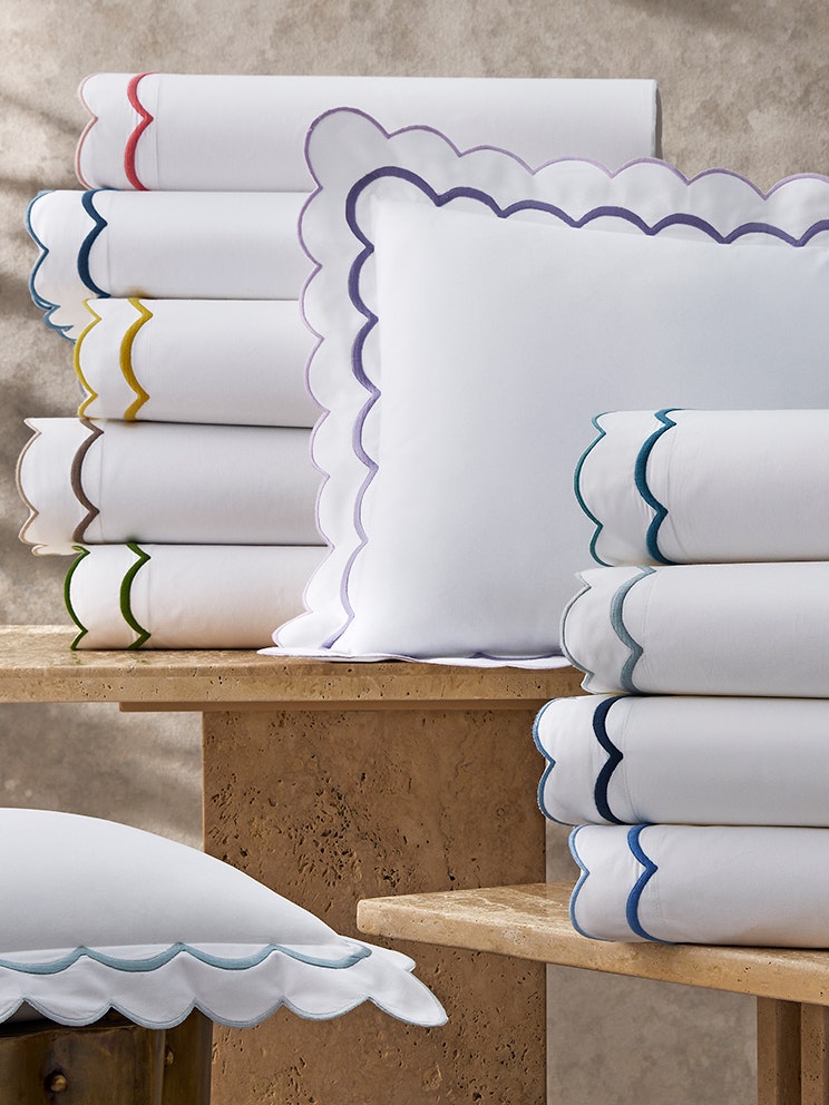
"Freshly pressed linens with beautiful trims and borders will always make a room feel tailored. I gravitate towards more restrained color palettes in bedrooms which always feel serene and pulled together.”
Any traditional bedroom design rules you like to follow or break?
"Don’t place your bed in front of a window is one rule I broke. This is a popular rule in California (due to the earthquake risk) but for other regions, I actually like the look of a headboard against a bay window—or in our case, a window along the side of the bed— assuming you pull the drapes at night.”
Can you give us some tips for achieving this look?
Stand Out
"Don’t be afraid to pick a statement fabric (even in a small space) and then choose one color from the print to weave through the rest of the room. For me, that was the perfect blue-gray which I applied to the walls and tied in through a Matouk duvet and sham in the same hue.”
Easy Does It
"Look for furniture that is visually “light” when decorating a small space. Here, I chose to create a canopy out of light-colored drapes instead of putting in a large wood four-poster bed. My gilded nightstand has delicate proportions and takes up less visual space than a three-drawer chest would.”
How did you come to select the Matouk bedding here?
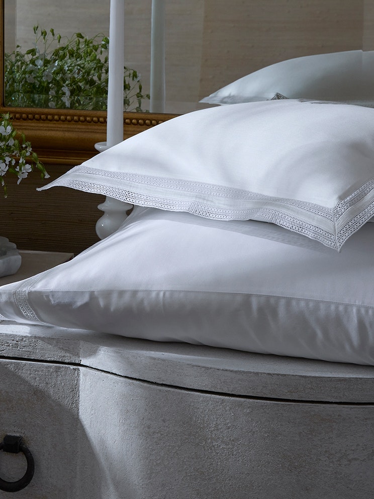
"We had our walls painted the most serene shade of blue (the color is Farrow & Ball’s Parma Gray). When I saw Matouk’s Grace collection in Hazy Blue, I knew it was a perfect match and I had to include it in our bedding. From there, I pulled in the India scalloped shams and sheets (also in Hazy Blue) and finished it off with a little fun pattern via the Attleboro boudoir sham from Matouk’s new collaboration with Schumacher. Matouk’s styles mix and match so effortlessly, you can create a designer look even if you haven’t hired a decorator. When using solid-colored bedding I think little details like textured fabrics and monograms are key to making everything feel special and considered. I love the way light reflects off the sateen Grace bedding; it looks and feels like a cloud and is the reason this space is so inviting.”
Tell us a little about your approach to the monogram?
"Matouk has so many beautiful monograms to choose from I couldn’t select just one, so I settled on two. One is an embroidered monogram and the second is a tonal appliqué . They are both exquisite. It’s amazing how much personality can come through in just three little letters. The embroidered monogram I chose creates such a sophisticated, tailored look and the larger appliqué style has a more romantic, heirloom quality to it. My husband and I both love the tradition of using the bride’s monogram on the linens as if these pieces were a part of my trousseau so that’s why we used my initials, SKF, on each piece. A tonal appliqué on a pair of pillowcases makes the perfect personalized wedding gift.”
Do you often use monograms for clients?
"As often as they’ll let me! There’s a perfect monogram out there for every style. I love how embroidering initials on linens instantly personalizes a space and turns bedding from a necessity to a keepsake—something you’d pass down from generation to generation.”
“I love how embroidering initials on linens instantly personalizes a space and turns bedding from a necessity to a keepsake.”