This Utah-based designer infuses a guest bedroom with exuberant color and textural balance.
You could say Hillary Taylor’s talent for capturing the colors of nature and infusing spaces with glowing light come naturally to her. She grew up in Northern California where natural beauty is everywhere. Now based in Salt Lake City, Utah, the designer has a new palette of stunning surroundings that she often draws upon. Her fresh take on traditional style renders clients’ spaces with a sense of timelessness while feeling fresh, family-friendly, and elevated. Taylor's signatures include cheerful color (often using blue, white, and grass green), a mix of old and new pieces, and subtle, textural layers.
Here, Taylor shows off her keen sense of design at a family’s Utah desert getaway. With views of the red rock mountains, this guest bedroom needed to make the outside shine while also holding its own. This space is, in the words of the designer, “punchy and happy with plenty of white space to keep it restful.”
Taylor breaks down the elements of the preppy modern look and shares techniques to utilize to pull off a similar crisp, considered sleep space anywhere.
If this room had a name, what would it be?
"Preppy clean chic.”
How did you land on this cheerful, crisp palette?
"We started with those yummy Hector Finch cactus lamps as a nod to everything going on outside. Cactus green was our starting point, luckily the sheets add a dimension to the room without matching perfectly. The bed look says the same thing—crisp, happy, and clean. It’s a great place you want to lay your head and refresh every night. I love a white bed, so that small scallop piping along the coverlet refers to the dominant color, but you still get a visually restful feeling that only white can bring.”
There’s a lot of great, subtle texture here. Tell us how you found the balance?
"Contrast and texture are always important to me. It’s the only thing that keeps things from looking one dimensional. As long as the scale and proportion are simultaneously balanced with texture, you can’t go wrong when adding another. Also, when you have a monochromatic room or any limited palette, texture is imperative to add authenticity. It’s that sense that hands were involved in creating something. It adds warmth and livability. And ultimately, texture hides all the happy accidents that occur from really living in a space. I’m always concerned with how a room will age and last for years. Here, we have glossy and sharp, heavy raffia and smooth raffia, wonderful poplin and my very favorite, pique. It reminds me of the best Florence Eisman Easter dresses of my childhood!”
"Utimately, texture hides all the happy accidents that occur from really living in a space. I’m always concerned with how a room will age and last for years."
How important are color and pattern here?
"The color green was the thesis for this space. It’s actually that simple. We call it the “green room.” The balance of solid versus pattern is a little like the overall plan for the room—provide enough space to rest the eye—so that you can enjoy the little things. Like a contrasting piping or the tiny print fabric on the back of the chair. In many ways, the bed is the restful spot and all the other pieces in the room work to balance it out or bring interest.”
Any traditional bedroom design rules you like to follow or break?
"I think there’s something to be said for mixing up the scale on a bed. A king-size bed can get boring with the three Euro shames lined up perfectly. In the ‘80s, you saw designer Mario Buatta put all the Euros at different angles and somehow that balanced out all the fussy in the rooms. Unfussy today doesn’t have to be a messy bed, but in this case, I went with an oversize bolster. (It’s actually enormous with that big 5” wide embroidered trim on it.) I think it feels fresh. Threes of everything gets a little boring too. I used the tiny bolsters elsewhere in the room. You can stack them on a side table or in a basket to use functionally. It’s a little bit of rule breaking to think of pillows as functional but I do. The more choices the better, especially in a guest room.”
Can you give us 3-4 tips to keep in mind when trying to achieve this look?
Don’t Match Everything...
"Make sure there is something just a little bit off or even zany in a room. Something to laugh at or about. Decorating is supposed to be fun.”
Go Natural…
"If you don’t have black, make sure you have something living or woven from something that used to be living! (like a basket) in a room.”
Get In Shape...
"Keep a balance of curves and rectilinear shapes between beds, sheeting, and lamps. In bedrooms especially, think about balancing rectangles carefully.”
Restrain Yourself…
"I wanted this room to be that preppy Kelly green from my late ‘80s junior high days. So I only picked colors that worked with that one value. I went monochromatic—I needed to stay in the same color value as well—to keep the balance flowing in the room. There is so much going on outside those windows. I didn’t need to tell an undulating color story inside. So, it was important to find the same saturation level in the bedding to maintain that crisp, preppy joy in the room. In short, know your boundaries and when enough is enough.”
"In short, know your boundaries and when enough is enough."
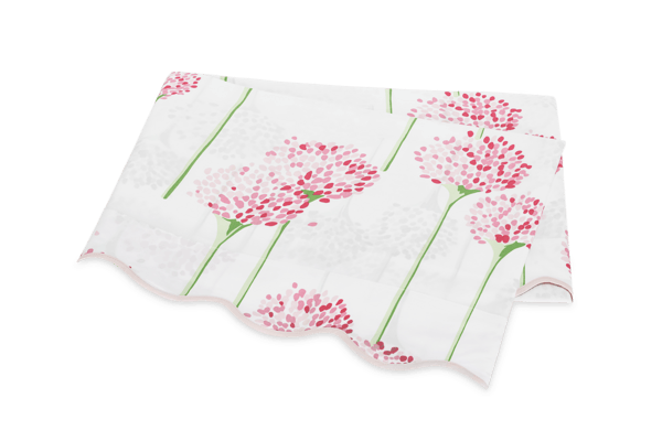
Tell us about the Matouk bedding you used here?
"I chose the Matouk x Lulu DK Charlotte sheets in Azure. They feel like silk. We also used the Lanai Coverlet in Tendril with matching duvet and shams. They layer so well. I love the crunchy pique next to the perfectly polished poplin. And the greens are phenomenal. Just like springtime grass. Charlotte is a little whimsical—not too serious—and the print is a great size for such a big bed. Lanai is just straight up happy and crisp—just what you need in a vacation home. Matouk has such phenomenal consistency in the quality of the products. I can trust that something will look great over time—and that it will look better in person than a tear sheet or a sample. I also love simplicity...and Matouk designs the most straight-forward lovely pieces. Because the quality is so high, the simplicity really shines.”